


Brief
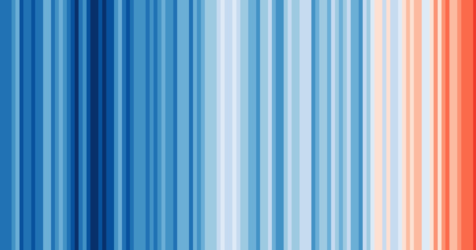
This project aims to show the components of the Climate Stripes and the visual process of building the infamous Climate Stripes. The Climate Stripes, created by Professor Ed Hawkins, is a set of bars of varying colours stacked together, with all bars of equal height. Together, the Climate Stripes show the changes in temperatures globally or within a certain region (continent or country) over the past 100 years, solely to raise awareness of climate change and empower the public to start a conversation about saving the planet 1.
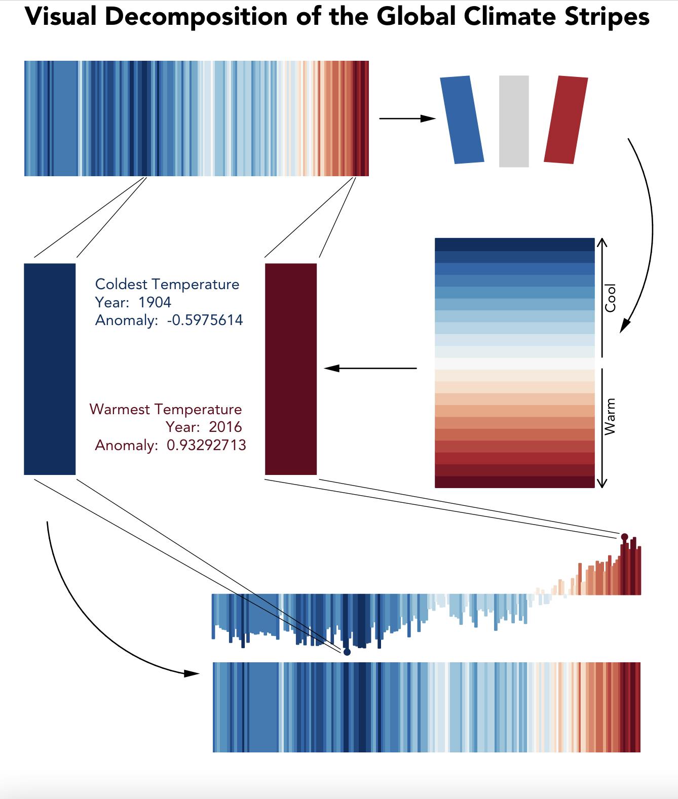
The design brief of this project is to create a visualisation that explains the climate stripes design for a journal publication targeted at the non-expert public. An effective way to understand a system is to take it apart and understand its components. In visualisation, this is akin to creating an exploded view of an object to view its internal components. Thus, I apply this method to create a visual explainer by creating an exploded visualisation of the climate stripes in response to the design brief. This exploded visualisation also serves as a visual walkthrough of how the climate stripes can be created.
I use a linear design process consisting of 4 steps to create the visualisation. The first step of the design process was to understand the climate stripes. This involved researching on the methods used, exploring alternative methods, and rapidly picking out components of the climate stripes. Thus, resulting in a list of components and possible methods to recreate the climate stripes. The second step involved visualising the components – the colour palette and bar. The third step was encoding the temperature anomaly values to colours. Lastly, all visual elements were combined to create a complete visualisation. The conception of this entire design project was done in the above steps and was aided using sketching. Figure 1.1 shows a rough sketch of the complete visualisation before implementing it using R programming.
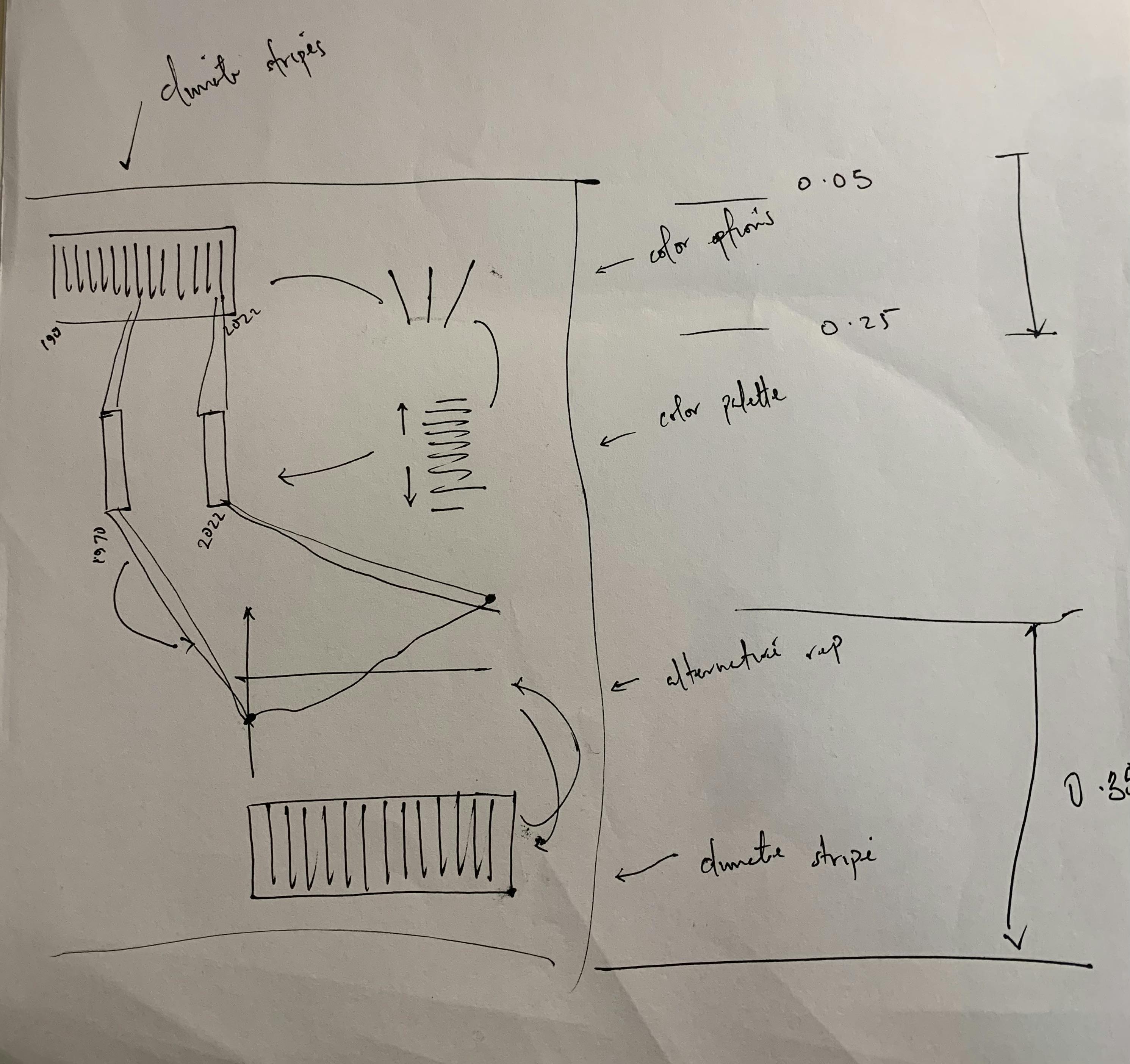
Figure 1.1 Project 1 idea sketch
The technique used in this project is an explanatory technique, starting and ending with the complete global climate stripes with an additional alternative form to aid understanding of the embedded data points. Additionally, arrows are used to show the process flow. This process flow aims to guide the audience through each step in the visual process.